My strategic work is rooted in understanding both the big picture and the operational realities that bring it to life.
Across my career, I have helped shape brand direction during periods of growth and change, translating organizational goals into actionable brand and marketing strategies. This includes aligning stakeholders across departments, defining brand architecture, and ensuring consistency across messaging, design, and customer experience.
The 2014 Global Credit Union rebrand is a clear example of this work in practice, where strategy played a central role in guiding a complex, multi-channel transformation across the organization.
Strategy
Overview
l oversaw the 2014 rebrand of Global Credit Union, leading a comprehensive transformation in response to rapid organizational growth and an increasingly commoditized financial landscape. At the time, the brand lacked consistency across channels, making it difficult to deliver a cohesive and recognizable experience or build the level of trust modern consumers expect.
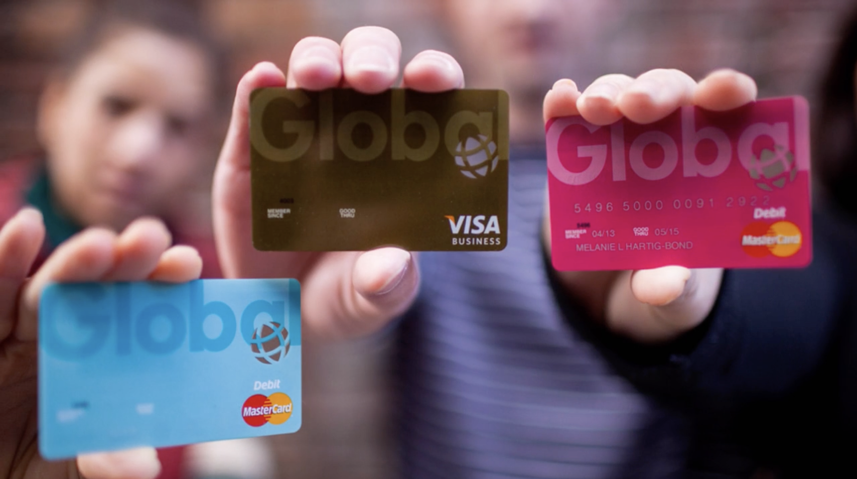
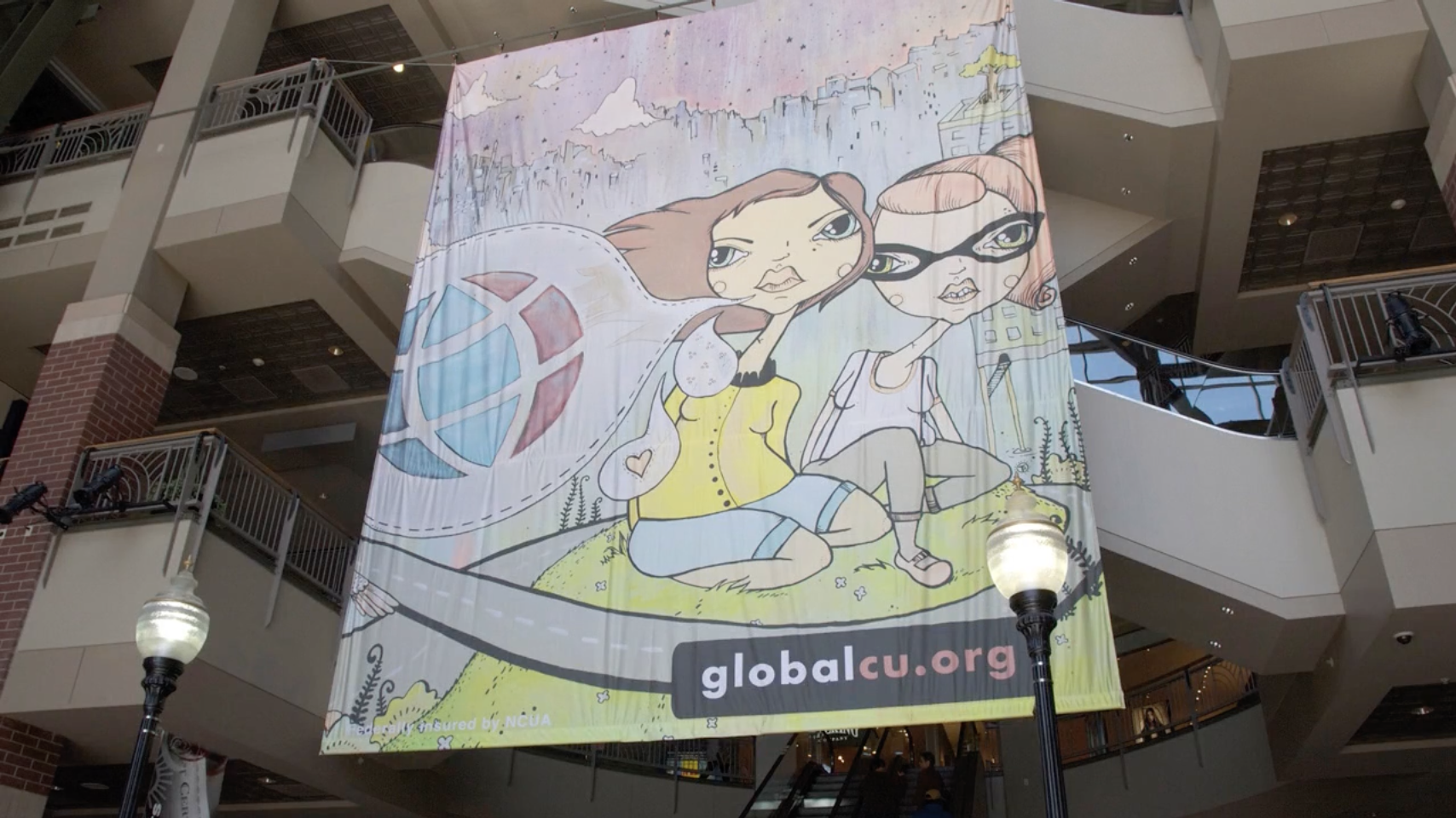
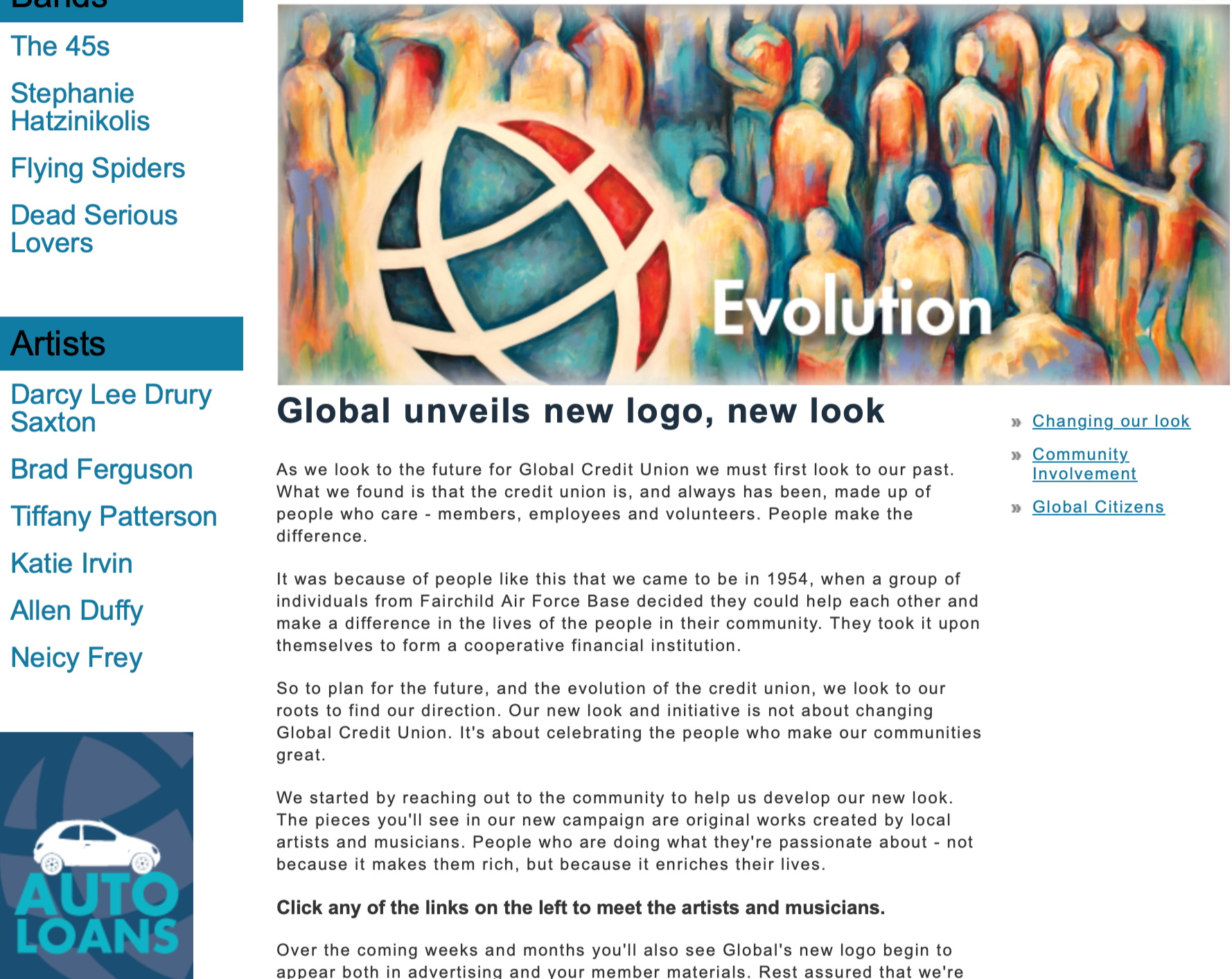
I helped define and guide a more human, unified brand direction rooted in authenticity and community connection. This included partnering with local artists and leading agency collaboration to develop a cohesive system spanning visual identity, messaging, campaigns, and environmental design.
With a small internal team and myself as the sole in-house designer, I played a central role in both strategy and execution while coordinating external partners and production vendors. This approach ensured the brand could scale effectively and be applied consistently across digital, physical, and in-branch experiences.
The result was a distinct, community-rooted brand that strengthened recognition, built trust, and reflected Global’s values in a more meaningful and cohesive way.
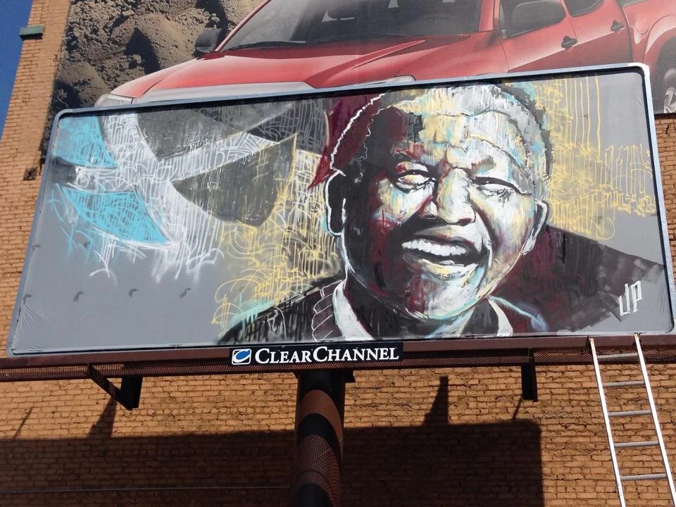
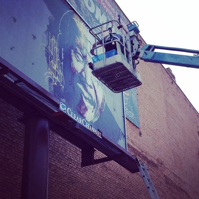
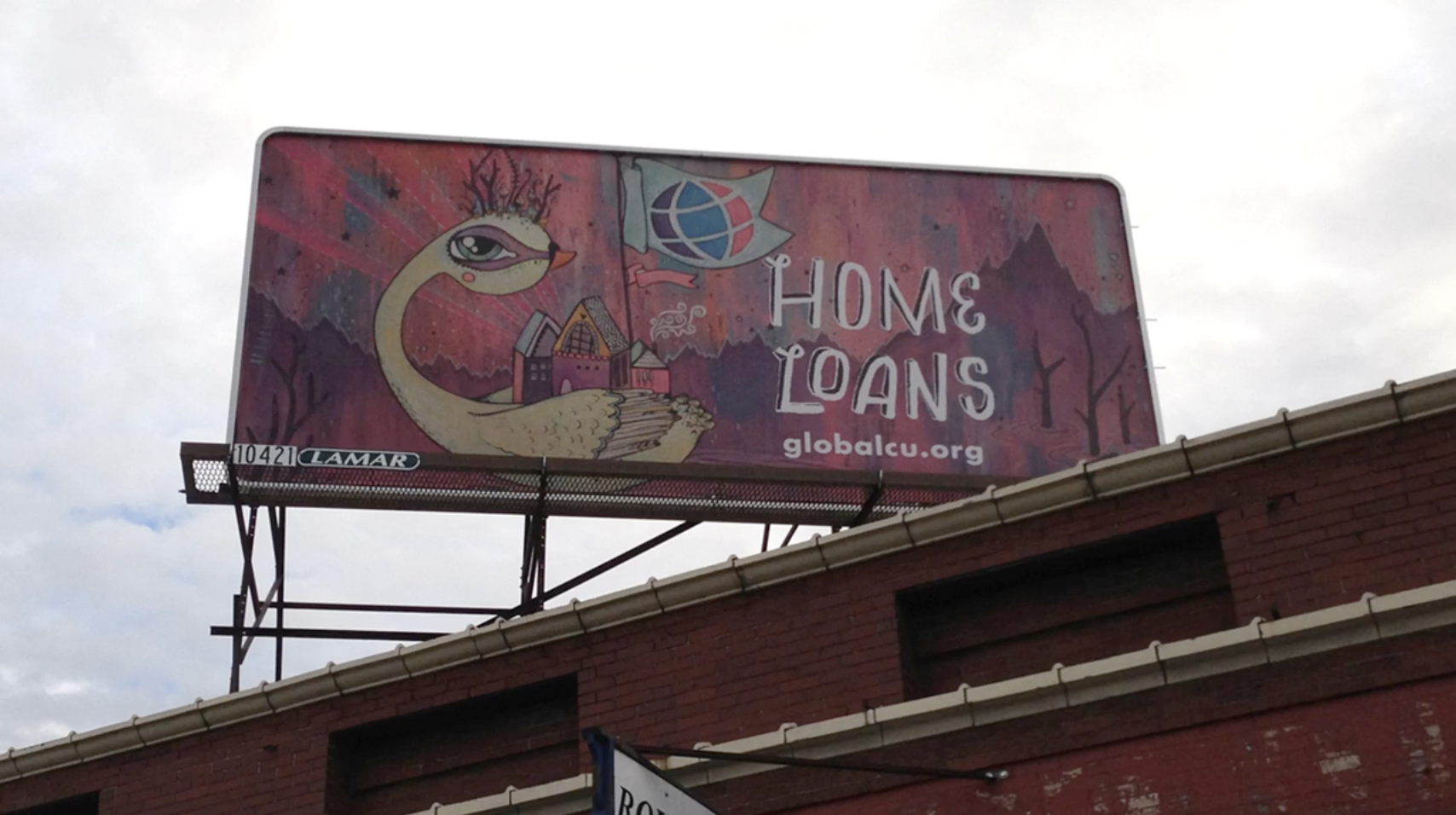
Live billboard painting event - downtown Spokane
Execution
The rebrand extended across all areas of marketing, requiring hands-on coordination to ensure consistent execution across digital, physical, and environmental touch-points.
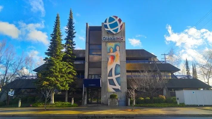
The rollout spanned multiple regions, including branches across Washington, Idaho, and international locations in Italy. Each location required updated signage, environmental design, and supporting materials, all aligned to the new brand system.
Key areas of execution included:
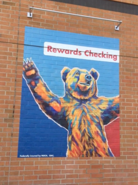
Applying the updated visual direction across campaigns, digital assets, and in-branch materials
Leading the redesign and ongoing management of the website to reflect the new brand system
Developing a library of reusable assets and templates to support long-term consistency
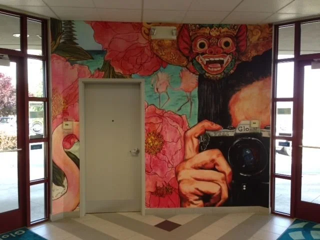
Sourcing and collaborating with local artists, coordinating commissioned work that reflected the brand’s connection to the community
Coordinating with external partners and production vendors to execute signage, murals, and environmental updates across locations
Supporting the rollout of updated core values through internal and external brand materials
Collaborating with third-party agency to concept, film, and produce commercial content featuring local musicians
The result was a cohesive brand system applied at scale, across both everyday marketing and large-scale environmental and campaign touch-points.
15 Separate locations needed to be redesigned, inside and out
Vendor coordination to print and install wall murals
View additional spots from the campaign → See More
Launch Strategy
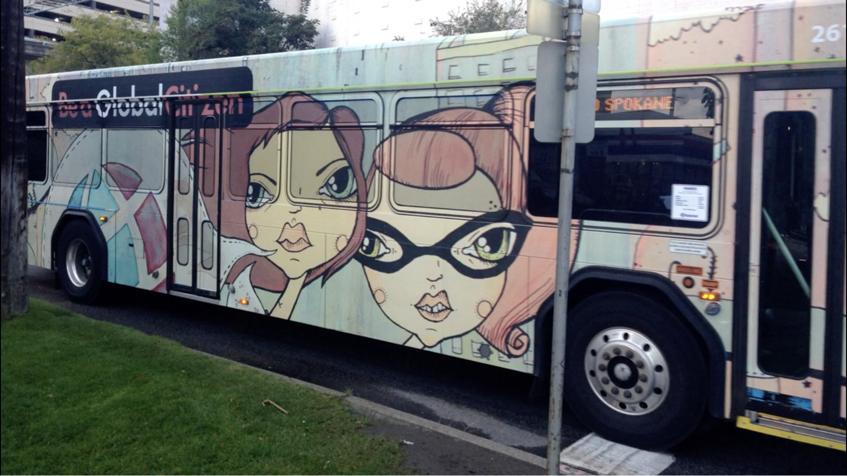
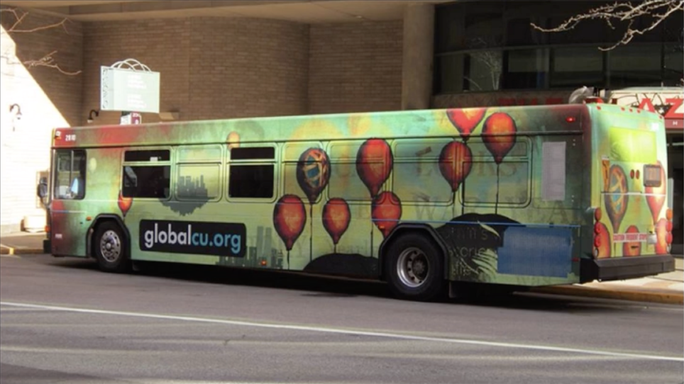
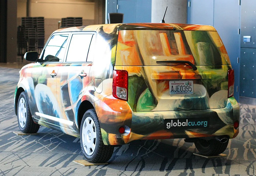
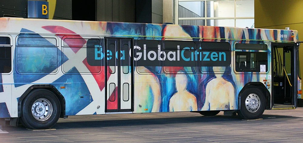
The rollout extended beyond traditional marketing into both public and internal experiences. Vehicle wraps were applied across company cars, along with a custom transit wrap designed to introduce the new brand to the broader community.
Internally, the rebrand was revealed at the 2014 employee conference through a fully designed, immersive experience. Two identical conference spaces were created — one in the existing brand and one in the new identity — allowing employees to physically move between them and experience the transformation firsthand. The reveal created a memorable moment of clarity and alignment, reinforcing the shift in both visual identity and brand values.
Approach
Brand Positioning
The rebrand focused on repositioning Global as more than a financial institution. As services became increasingly commoditized, the goal was to emphasize trust, community, and human connection — reinforcing the idea of “Everybody’s Credit Union.”
Visual Direction
The visual system was designed to feel more expressive and human, incorporating layered imagery and storytelling elements that reflected real people and local culture. This approach helped move the brand away from traditional financial aesthetics and toward something more relatable and community-driven.
Core Values
Updated core values were introduced as part of the rebrand, helping align both internal teams and external messaging around a shared identity and purpose.
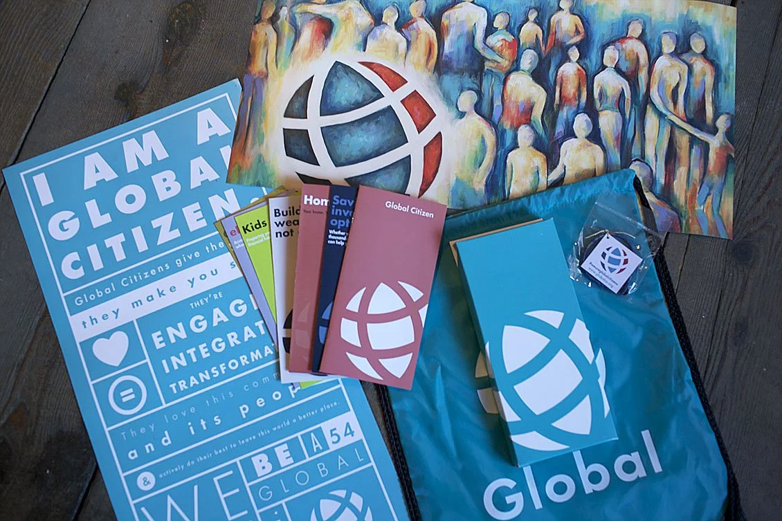
Global Member Kit and Core Values Introduction
Impact
The rebrand established a cohesive brand system that could be applied at scale, across both everyday marketing and large-scale environmental and campaign touchpoints.
This brought consistency to a previously fragmented brand, making it easier for internal teams to create aligned materials and maintain a recognizable presence across regions.
The updated visual direction and community-driven approach helped position Global as more human and culturally connected, while supporting continued growth across new markets and initiatives.
The rebrand was recognized at both regional and industry levels, earning multiple awards for excellence in branding and marketing strategy.
Recognition includes:
AAF Spokane American Advertising Awards — 18 awards including Best in Show and Best of Division
Credit Union Executive Society — 2014 Brand of the Year Golden Mirror Award
CUNA Marketing & Business Development Council Diamond Awards — Global Member Kit
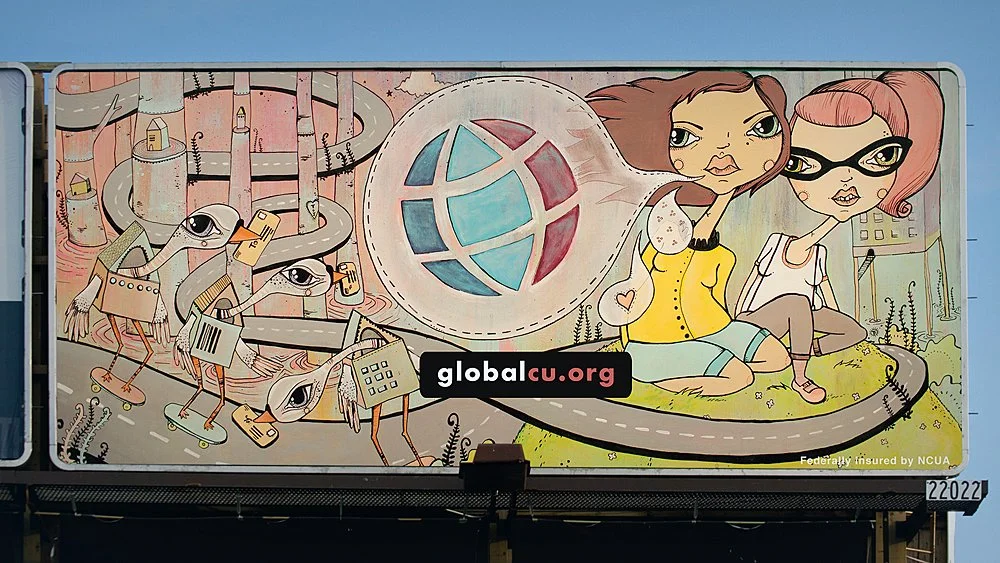
Billboard design, artwork commissioned by local artist Tiffany Patterson